LoadLab Platform Dashboard
Task management tool accelerates decision-making in QA workflows

Overview
LoadLab, initially built for QA engineers, faced UX challenges as it pivoted to a consumer-grade solution. I partnered with the PM to define success metrics, prioritize the roadmap, and deliver a redesigned dashboard and user flows, supported by a modernized design system.
The new vision gained internal recognition for its potential to succeed in the consumer market.
Responsibility
UX Designer— Interaction Design, Visual Design, User Flow, Prototyping, UX Research
Timeline
June - July, 2023, 2 months
Collaboration
Sr.UX Designer, PM & Tech lead, QA Users, Engineers
Impact
- 5.26% ↓
Reduce avg time for identify issues
-12.4% ↓
Reduce avg clicks for scheduling tasks
+56.8% ↑
Improve the user satisfaction rate
Context
A consumer-grade pivot for LoadLab
A Testing Tool
As Blizzard’s partner in China, NetEase owns LoadLab. It allows quality assurance (QA) engineers testing various high-traffic scenarios (large numbers of players online) and identify the best CPU plan, prevent downtime before they have bigger business impacts.

How LoadLab Works
Image
The Pivot
Previously developed as an internal tool, LoadLab began its transition to a SaaS product in Q2 2023. However, low internal user satisfaction highlights potential challenges for this shift.
Problem
Dashboard’s UX issues blocking the pivot
Inefficiency in Workflow
One user manages 10-20 tasks groups daily, where quickly locating cases boosts user satisfaction by reducing wasted time. However, poor dashboard navigation hinders this efficiency, impending NetEase's global expansion goals.
User Quotes

Current Product Dashboard
Image
Solution highlight
Enhance dashboard usability to improve work efficiency
New Dashboard Experience
Demo
🚧 / Challenge
With messy feedbacks and scattered requirements,
how might we drive a clear direction to revamp user’s experience and pave the way for enterprise-grade service?
Strategies
Clearing the fog: identifying frustrations at every step
Collaborate with PM
Without a dedicated PM, I took the initiative as a designer to conduct research, identify core issues, and collaborate with the team to develop a clear and actionable roadmap.
Analysis User Workflow
I interviewed 10+ QA users to identify workflow bottlenecks. Mapping JTBD helped me uncover struggles beyond UI issues.
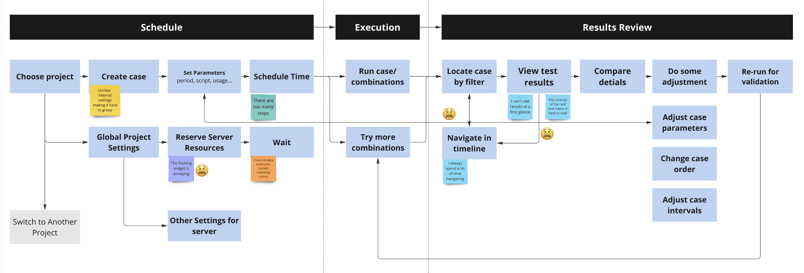
User Flow Diagram
Image
Conclude User Pains
Misaligned information hierarchy leads to frequent misclicks
Overwhelming information makes navigation across timeframes hard
Low task readability and unclear shortcuts clues slowdown work
How might we
Optimize the end-to-end testing workflow for QA engineers to facilitate efficiency across scheduling, execution, and results review.
Challenge /1
Restructuring information
💬 / quotes
“Please remove this ‘help doc’ to anywhere else”--PM
“The floating widget hide in my way”--QA user
Analyses - Hierarchy and Frequency
Instead of simply accepting the requirement, I analyze usage frequency and information hierarchy to ensure the design aligns with user behavior. And I identified several misalignments.
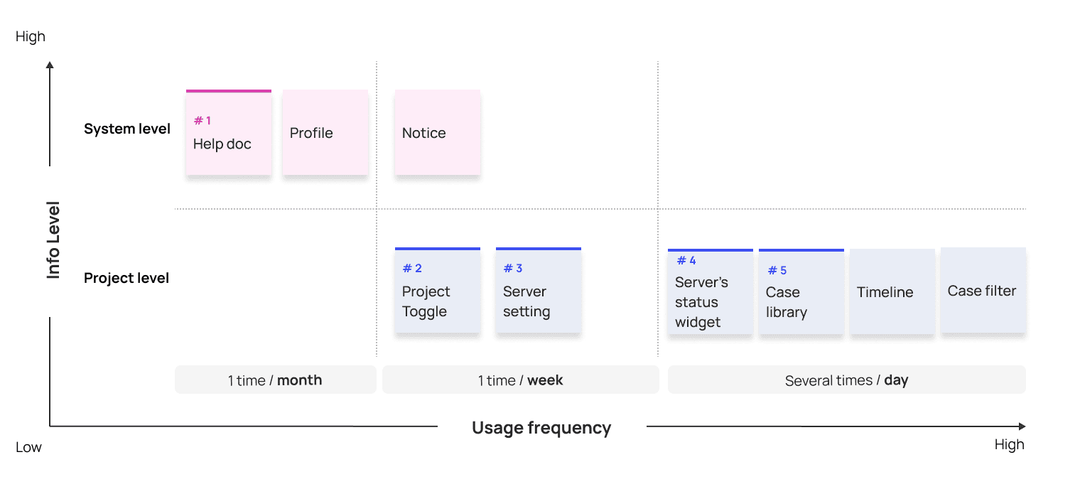
Matrix Diagram
Image
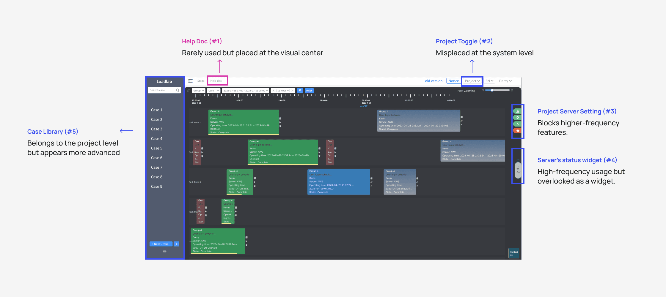
Misalignments Mapping
Image
Solution - Layout Features by Hierarchy and Frequency
First, I restructured the top bar, which operates at the system level and should be visually prioritized over the sidebar, which functions at the project level.
Then, I laid out the features based on usage frequency. For example, low-use features were anchored to the sidebar to reduce distractions.

Matrix Diagram
Image
Challenge /2
Enhancing task discovery
💬 / quotes
"I feel I spend too much time searching for past tasks, scrolling excessively vertically and horizontally."- QA user
Solution
Task Discovery Flow
Demo
Design decision
Filter to Better Focus
Interviews revealed that the user's own tasks were the highest priority. Therefore, I explored various filtering components and, based on team feedback, ultimately decided on a dropdown menu for consistency.

Rationale Behind Filter Design
Image
Testing & Iteration
Smaller Card, Reduce Scrolling
Testing revealed further opportunities to reduce scrolling. I streamlined card content to emphasize key information, increasing visible tracks per screen and minimizing vertical scrolling.
Notably, “state” needs to occupy a separate row because colors alone cannot distinguish states, ensuring A11y compliance.

Rationale Behind Card Design
Image
Design trade-offs
💬 / quotes
"I scroll to check the overall task states, cross a wide time range"- QA user
How might we enable an overview that balances readability, clicks, and feasibility?
I brainstormed two solutions: one required frequent time scale switching, and the other enable two scales at once but require more time developing. After discussing with the dev team, we chose option 2.
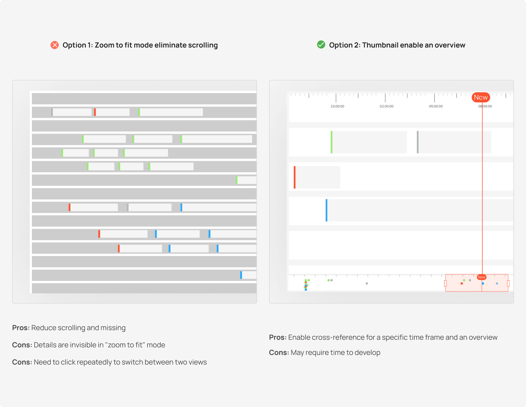
Rationale Behind Overview
Image
Detailed Hand-offs
After receiving strong support from the dev team, I enhanced the solution's responsiveness and accessibility, incorporating features like color-coding and keyboard navigation.

Plan Dive-In
Image
Challenge /3
Redesigning micro interaction
💬 / quotes
“I didn’t use the shortcut feature as I even didn't noticed it”--QA user
Solution
Redesigned the Card Shortcuts to Improve Usability and Ensure Accessibility
After understanding user actions after finding a card, I initiated a redesign. I enhanced icons for clarity, optimized static mode for compactness, and improved drag-and-drop motion for pleasure.
Card Micro-Interactions
Demo

Component Annotation
Image
Retrospective
Progress Went Well!
The LoadLab prototype for this stage was presented in July 2023 and received strong positive feedback. Leadership praised the progress and approved further functional enhancements.
After launch, internal work efficiency improved by 25%, task scheduling clicks dropped by 12.4%, and employee satisfaction increased by 56.8%.
“
Co-Worker quote
Jiaqi gets things done quickly and really well, all while keeping communication super smooth and easy.
PM & tech leader
“
User quote
Their creative solution to timeline navigation was super effective.
QA user
And I Learned a Lot!
Asking deeper questions works wonders
Going beyond complains uncovered hidden issues, leading to more meaningful design solutions.
Collaboration drives clarity
Aligning on metrics and goals early ensured the team stayed focused and delivered impactful results.
Planning for edge cases avoids chaos
Learning edge scenarios upfront smoothed handoffs and prevented last-minute surprises.