Starbucks app for better off-line experience
Starbucks, China
Strengthening Starbucks' branding as the "Third Space" by integrating online and offline user experiences.

Overview
The story of a big fan
As a big fan of Starbucks, I frequently use their app. However, I've recently noticed that it struggles to connect me with the stores, making it inconvenient to find information and choose the right location. Is this just my personal opinion?
Problem space
Coincidentally, market feedback indicates that as the global consumer market evolves, local chains and independent coffee shops are emerging, challenging Starbucks due to widespread product innovation and equal marketing opportunities. While Starbucks' “Third Place” concept (a welcoming space for relaxation) is a key feature, user feedback shows that this idea isn't effectively represented in their app.
So, how can Starbucks enhance its brand identity and highlight its unique strengths?
Solutions
In response, I redesigned the app to enhance the offline experience and strengthen its core branding as the "Third Space"—a relaxing spot between home and work.
Market Research
I. Users' Perspective
Who is Starbuck's main customer and how they use Starbucks' space?
According to an online report focus on Chinese Starbucks customers cross the whole coffee market, the main customers are students and business people. And an online survey among 45 people reveals: for work, business, and leisure.
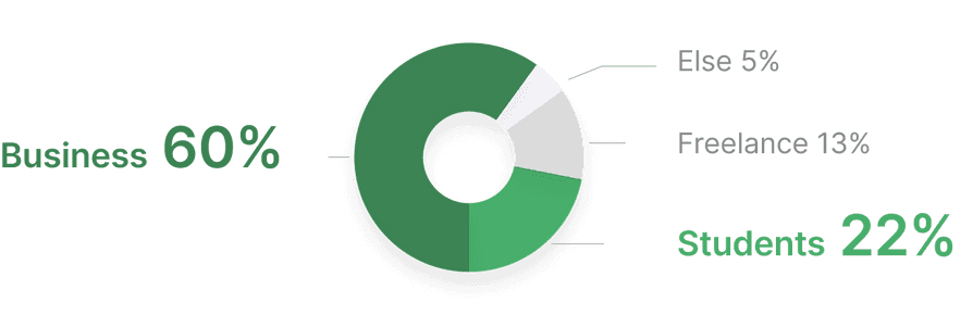

Source: Characteristics (culture, income, habit) of Starbucks consumer in China
II. Business Perspective
Though have increasing focuses on app, in-store experience still receive continuous emphasis
In the fiscal third quarter ended July 3, Starbucks' mobile order sales reached a record 47%, up 13% from the previous year, indicating ongoing improvements in customer experience in the e-commerce era. However, as former COO Roz Brewer stated, the value of the offline experience remains significant.

Source: Starbucks China third quarter, 2022

So, Starbucks should emphasize its offline experience, while the mobile app could serve as a bridge connecting customers to the in-store environment
Understanding Users
Customer interview
I conducted 1-on-1 semi-structured interviews at Starbucks, focusing on specific questions. Afterward, I categorized the responses from 12 users' post-it notes by priority and identified four key insights.

Persona
The results showed that consumers who value the space and need assistance from the Starbucks app can be divided into two groups. This helped me create personas to driven redesign process
Occasional customer: focus on selecting a place

Regular customer: Care about real-time status

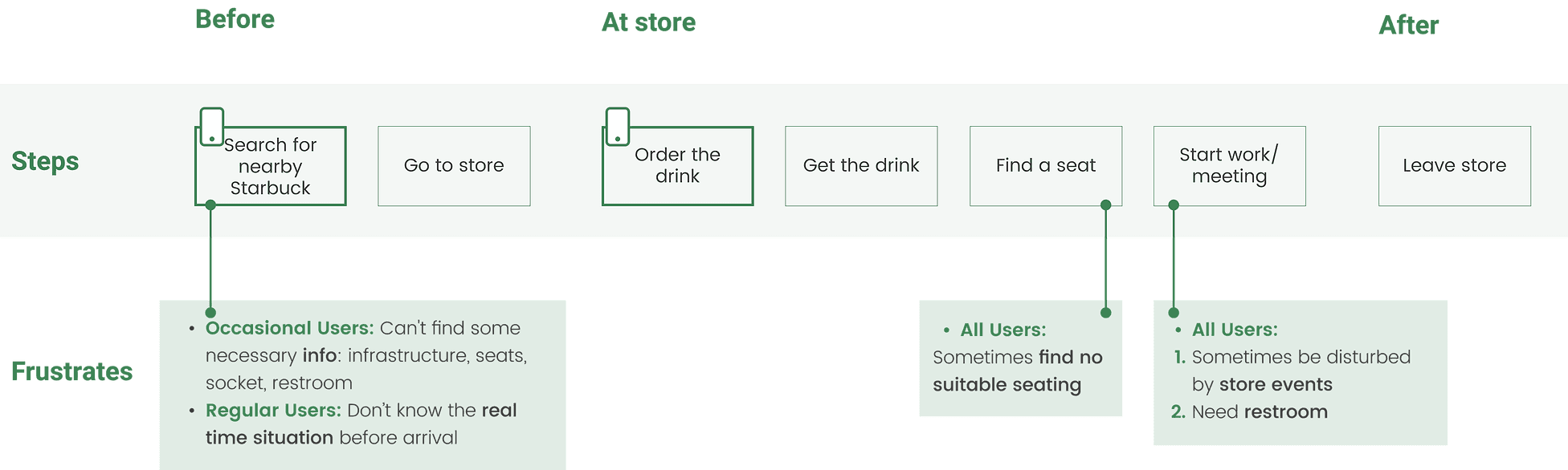
customer journey
I found that occasional users typically use the app twice: once to find an ideal store and again to place their order. In contrast, regular users mainly use the app to order food. However, both groups express frustration over the lack of crucial information before entering the store.
Explore the Current App
Current user flow: users lose connection with the physical store
The journey map shows that users can’t get info like infrastructure and real-time conditions. And as the app is the only way for customers to learn the store, I dive into user flow in the app focus on this part.

Current information architecture: help me reveal the gaps
Understanding the information architecture, particularly the sections related to 'store experience,' will give me a broad view of the existing system and help identify any gaps.

Synthesis on current issues

How might we strengthen the connection between stores and customers while reinforcing Starbucks' "Third Space" advantage through the existing app?
Ideation
Design principles
I focus on reinforcing the "Third Space" branding philosophy in this app redesign. I believe its principles will help convey the new concept and modernize the customer experience.

Revise information architecture

Prototyping
I sketched the store exploration screens and user flow, focusing on refining key areas while keeping the existing layout and UI. Here are the updated screens:

Features
Feature 1 - Simplified store exploration to reduce clicking steps

New flow 1
Place the filter next to the search bar and organize elements by importance
Add more details to each item in the store list

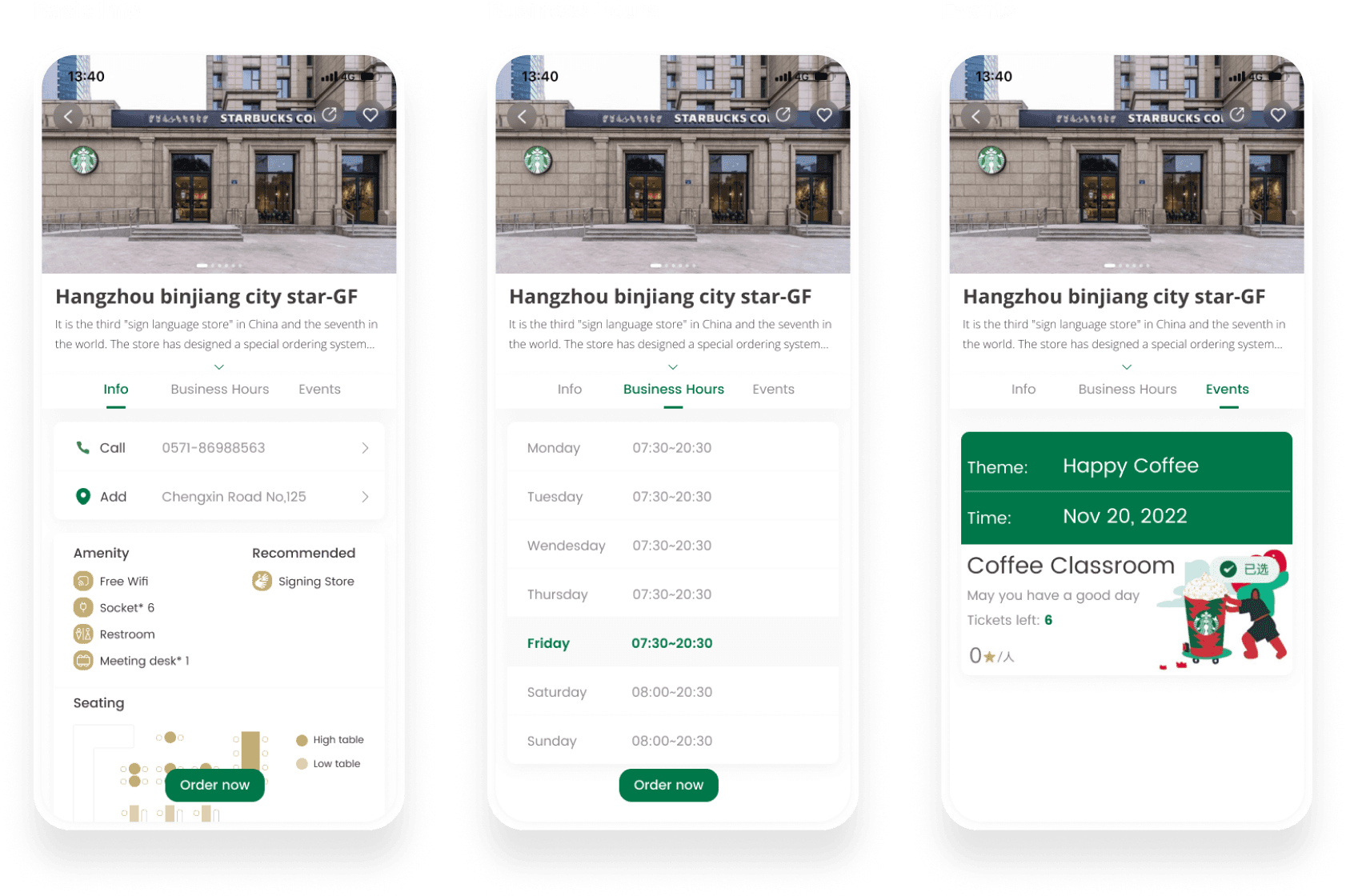
Feature 2 - Enhanced store details with a clear information hierarchy

New flow 2
Organize information in a more clear hierarchy
Direct way to order at this store in advance
Feature 3 - A clearer and more transparent ordering process

New flow 3
Straightforward and consistent
No back and forth confirming flow
Connect with the store detailed info page

Reflection
01. Brand innovation
E-commerce and digital marketing have created a level playing field for businesses and customers, redefining competition. For Starbucks, innovation goes beyond new products; it should also include communication, organizational culture, and promoting brand values through online channels.
02. Stick to own values
Staying true to its brand values is a key form of innovation that can strengthen Starbucks' competitive advantage. By continuously enhancing the customer experience in-store, Starbucks can maintain its leadership in the coffee industry and remain differentiated in customers' eyes.
03.Don't forget offline experience
While many apps focus on online user experience, I prioritize offline connections. I hope apps can bridge the gap between users and stores, creating a "third space" for interaction.